Greetings everyone,
Another year, another New York Comic Con has come and gone. We’ve recovered from the exhaustion of setting up, running and breaking down the booth that we are, once again, ready to come back to the air.
As some of you may have seen, we decided to shake things up for this year’s NYCC . While we stayed at the same location as last year, we decided to buy a web banner ad that ran on NYCC’s website, with the belief that it would help promote our presence at the exhibition floor, and thus perhaps lead to more sales opportunities. To compliment the ad, we also had a specific landing page for the ad, providing readers with what we offered, where we were, to ad us to their agendas, as well as other tidbits of information.
We knew from last year that, if we were to stay in the area, we had to do two things: provide an enticing booth display and also provide an overall experience that you can capitalize either on its own for financial purposes, or as a means of driving traffic to your wares (and as such increasing your sales opportunities). Unlike in previous years, we did not want to share our booth: rather, we wanted to use every space available to provide an Odd Truth experience.
First, based on a number of sources that we read, we believed that an open layout would be best. We wanted our booth to be approachable, and really tried to do our best to model our booth experience to that of an Apple Store. Or, as close as possible as we could afford, given our limited (read: VERY LIMITED) budget. Furthermore, aside from our books, we wanted something else, something very tech driven, that could both be tied to Torchbearer AND provide a secondary, somewhat passive, source of income. We spent months going through different ideas (I think at one point we thought about setting up 3D scanners and providing people with 3D printed copies of themselves) and, at the last minute, we settled on integrating a Virtual Reality experience.
For the actual booth display, we took inspiration from Press Bound, Fawnsberg and Megan Auman’s Designing an MBA in their portable booth displays and ideas. However, somewhere in the deep recesses of our mind, we mixed up the materials and support structures used by the different websites, and ended up building a booth out of foldable plywood (note to future booth designers: NEVER BUILD SOMETHING PORTABLE OUT OF PLYWOOD. IT’S TOO HEAVY). In the end, thanks to the brilliance of both Victoria Rodriguez, our production designer, and Reid Beaman, one of our booth volunteers, we resorted to using our Plan C: a cloth wall with our posters hanging from them.
Here’s how it looked like as we were building version 1 of the Plan C booth display, and the final iteration of this version.
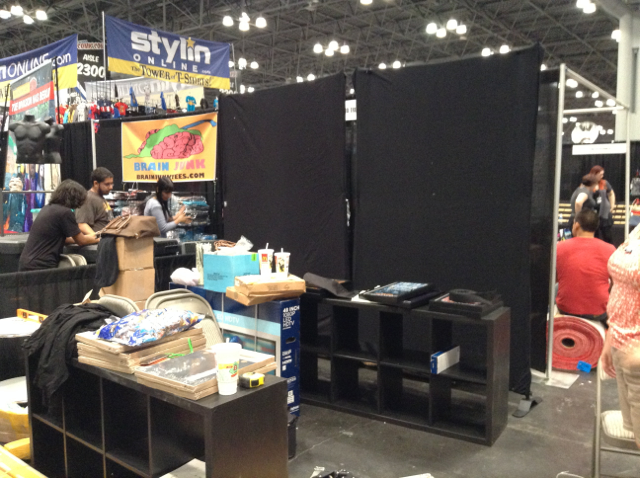
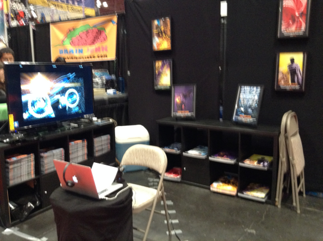
The idea behind this L-shaped layout was to capitalize on an open layout where people could walk in and be approached and feel comfortable inside the booth. We (the booth volunteers) could then approach potential customers and just engage with them, eventually converting them to Torchbearer customers (similar to how Apple Store employees work). To further entice attendees, we had both a trailer we made for Torchbearer, as well as a connection to the Oculus Rift demo/experience (seen here on the right, where you see the Macbook Air). We thought that we would switch between the Oculus Rift and the trailer, using both to drive more and more attention to the booth. Eventually, we were thinking of adding a live video feed from one of our drones, but alas, one of the propellers was damaged and we were unable to find a replacement in time.
So, how did this booth fare at NYCC?
Thursday
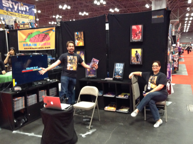
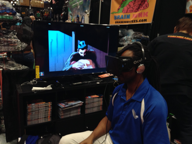
We had a lot of foot traffic at our booth, something that was unusual to us (unless we were giving away T-shirts). Needless to say, we were quite excited. Furthermore, we thought we had fair and adequate price points for the Oculus experience (5 mins for 5 dollars, 10 minutes for $8.00, 15 minutes for $12.00). And everyone loved it. However, we soon realized two things: 1) selling time is a limited resource, one that has a fixed amount of return per day and 2) we believed our current layout cannibalized our book sales. As for the latter, we realized this was the case as everyone asked about the Oculus, but were hesitant to even hear about Torchbearer when approached. Overall, our goal for the booth was changed from how to drive traffic into our booth into how we could increase our book sales, given the traffic we’re getting?
Friday (and onwards)
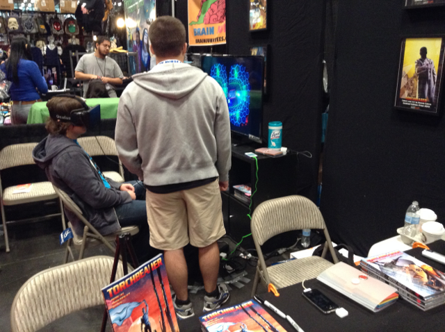
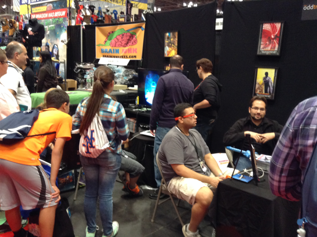
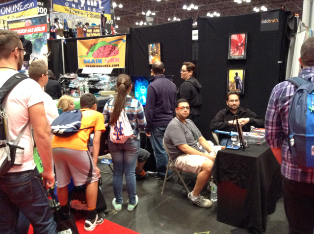
We changed the booth to what I call an “inverted-L” design, with a kind of table facing one of the aisles, open space in the middle, two chairs at the opposite end of the booth where people could sit and wait in line, and the TV with the Oculus hardware. Why did we do this? Well, the table facing the aisle provided some division to the booth, as well as a platform where I could approach and pitch the booth to people without them necessarily being aware of the Oculus demo. I knew, based on the previous day’s feedback, that the Oculus would attract attention on its own. As long as the remaining volunteers could handle the traffic and ensure that there was a steady queue, I could be left alone to pitch and sell Torchbearer (a significant shift from our efforts of previous years) to passerby’s.
The first few hours on Friday caused us to stumble a little bit, as we were really trying to push the purchase of an Oculus experience that coincidentally included a book (cause, let’s be honest, we knew what really drove traffic at that point). Upon further experimentation, and some quick-thinking math, we then decided to separate the Oculus experience from the book: each would stand on its own and not drive traffic to one another. This also led to a different time and price point. Once we realized this, the Oculus experience was a well-oiled machine throughout the rest of the weekend.
And needless to say, we were quite, quite happy about it 🙂
Lessons learned
Honestly, this year’s NYCC partly affirmed our hypothesis from last year: it’s all about the experience. More importantly, for us at least, people reacted VERY positively to the VR experience. As this is in line with Odd Truth’s desires and experiences, we will seek to capitalize on this insight for future comic-cons (how exactly, it’s still to be determined). Overall, this year was probably the smoothest NYCC experience we have had so far, even despite all of the complications we had. Our staff this year was stellar, our location was great (for what we were offering. Had we been offering only books, I personally think we would have been screwed) and our traffic was consistent.
We look forward to more NYCC’s like this one 🙂
We’ll have more notes on our NYCC strategies and sales, along with notes from most of our comic-cons of 2014, in the coming weeks. We’re just about done with gathering our data. We are about to start processing it and, well, writing our analyses down.
Well, that’s it for now.
Until next week.
Best,
-Nick D.

